Designing for Impact: How Typography Defines Your Brand’s Voice
Estimated reading time: 5 minutes
- Typography establishes brand recognition.
- Fonts convey your brand’s personality and values.
- Legibility is paramount for effective signage.
- Consider compliance and regulations in Jacksonville.
- Local expertise enhances visibility and branding.
Table of Contents
- The Role of Typography in Brand Identity
- Practical Typography Tips for Business Signage
- The Compliance and Permitting Perspective
- How SignLabJax Integrates Typography Into Your Brand Strategy
- Practical Takeaways for Your Typography Strategy
- FAQ
The Role of Typography in Brand Identity
Establishing Recognition
Every great brand starts with the need for recognition. Typography functions as a visual cue, allowing consumers to immediately identify your brand among competitors. Think about household names such as Coca-Cola or Google. Their distinct typefaces are not only recognizable but also evoke certain feelings and experiences associated with their products or services.
Having a well-thought-out typeface allows your signage and branding materials to stand out, creating a lasting impression. In practice, businesses in Jacksonville have found that consistency in typography across all platforms—from storefronts to digital media—enhances brand recall and loyalty.
Conveying Personality
The personality of your brand is often depicted through its typography. Fonts come with inherent emotions; for instance, a rounded sans-serif may feel friendly and approachable, while an elegant serif could depict sophistication and tradition. By carefully selecting a typeface that aligns with your brand’s values, you provide customers with immediate insight into your company’s essence.
For instance, if you are a law firm, a strong, classic serif may underscore your professionalism and reliability. Conversely, if you run a creative agency, a playful and modern sans-serif can reflect your innovative spirit. This consideration ensures that your brand’s voice is communicated effectively before a single word is spoken.
Practical Typography Tips for Business Signage
1. Choose Legibility Over Complexity
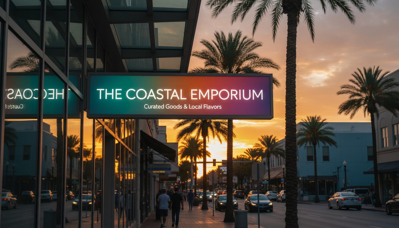
While you may be tempted to select a highly stylized typeface, remember that your primary goal is to ensure clarity and legibility. Complex fonts can lead to confusion and misinterpretation, especially at a distance. In high-traffic areas of Jacksonville, where potential customers are moving quickly past your signage, clarity is essential.
Stick to clean, simple fonts that can be read quickly and easily. Test your signage by showing it to individuals standing at different distances to ensure that the messages are easy to read from a distance, regardless of foot traffic or environmental distractions.
2. Stick to a Limited Typeface Palette
Using too many different fonts can confuse and dilute your brand’s identity. A limited palette—usually one or two typefaces—ensures visual harmony and cohesion across your signage. This restraint creates a seamless aesthetic, allowing your brand to maintain recognition and professionalism.
For effective signage, consider using one font for your main messaging and another for your calls to action or secondary information. For example, a bold sans-serif can be effective for headlines, while a lighter, more understated font can work well for subtext.
3. Consider Size and Scale
The size of your typography plays a key role in its effectiveness. Ensure that your headlines are large enough to capture attention, while subheadings or additional information is sized appropriately without competing for attention.
In Jacksonville’s diverse urban landscape, factors such as distance from the viewing point and ambient lighting can influence how your signage is perceived. Ensure that your signage is always visible no matter the time of day or weather conditions.
4. Be Mindful of Color Contrast
Color can enhance the readability of your typography by creating contrast, but it can also detract from it if not chosen wisely. Ensure that text stands out against its background; for instance, light text on a dark background or vice versa.
Additionally, your color choices should align with your brand’s overall color scheme and evoke the desired emotional response. Many Jacksonville businesses have benefited from establishing a strong relationship between their typography and color palette, enriching their branding and increasing customer engagement.
The Compliance and Permitting Perspective
When considering typography for your signage, local ordinances and compliance regulations in Jacksonville must be taken into account. Not only do aspect ratios, size, and materials require adherence to guidelines, but the legibility of typography often falls under these regulations as well.
Navigating Local Regulations
Before finalizing the design of your signage, it is essential to consult with local government or permitting offices. Certain zones may have restrictions regarding sign visibility, size, and design. At SignLabJax, we can help guide your project through the compliance maze, ensuring that your typographic choices align with local regulations and enhance your visibility without running into legal pitfalls.
By dealing with these aspects upfront, you can avoid costly redesigns and delays, making the process smoother as you prepare to unveil your updated visual identity.
How SignLabJax Integrates Typography Into Your Brand Strategy
Customized Solutions for Local Businesses
At SignLabJax, we pride ourselves on our ability to create customized solutions that align with your brand vision. Whether you’re redesigning storefront signage, creating wayfinding systems, or developing promotional materials, our expertise in typography and design will ensure that your brand speaks clearly and effectively.
Expert Consultation and Design Services
Our experienced team offers consultations to understand your branding needs and how typography fits into the broader narrative of your identity. We discuss your audience, your message, and your aspirations for visibility. Our design process is collaborative, ensuring you are engaged at every stage—from brainstorming ideas to producing final drafts.
Pain-Free Installation and Compliance Checks
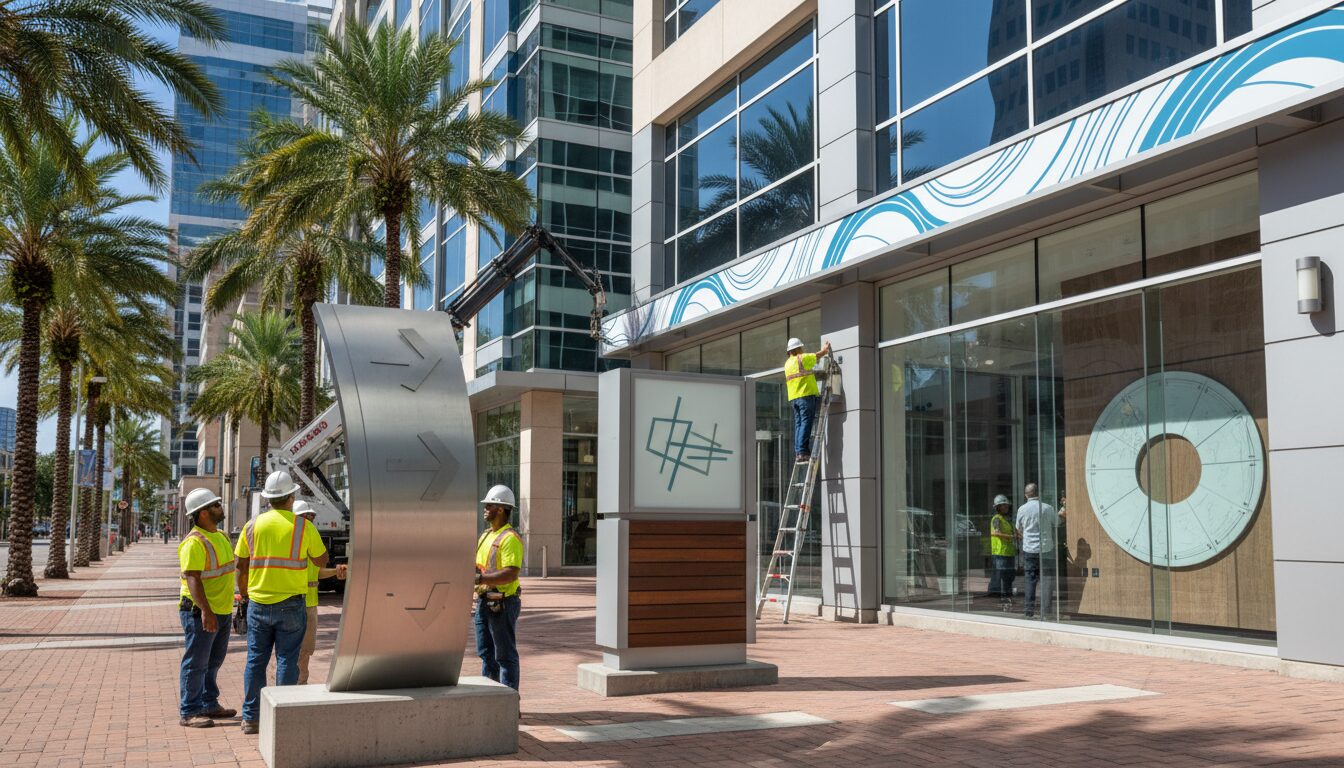
Once your signage design is finalized, our team provides seamless installation services that adhere to local compliance and approval processes. We take care of all permitting, ensuring that the typography choice meets legal standards for visibility and scale.
This holistic approach assures that your brand messaging is clear, consistent, and compliant, leading to greater success in reaching your audience.
Practical Takeaways for Your Typography Strategy
- Define Your Brand Voice: Analyze what emotions and characteristics you want your typography to evoke. Align font choices with your brand identity.
- Test for Legibility: Always prioritize legibility from various distances and conditions to ensure your signage is as effective as possible.
- Limit Typefaces: Use a maximum of two complementary fonts and maintain uniformity to bolster your brand’s professional appearance.
- Utilize Local Expertise: Work with signage professionals, like SignLabJax, who understand local regulations and can provide tailored solutions that ensure compliance and maximum impact.
By strategically incorporating typography into your signage, you can significantly elevate your brand’s voice and visual identity, making a lasting impression on your audience. The right font choice can help you convey professionalism, creativity, or reliability—whatever best represents your business’s essence.
FAQ
What is the best font for business signage?
The best font for business signage is one that is clear and legible from a distance. Sans-serif fonts are often recommended due to their simplicity and professionalism. Always test your chosen font to ensure it meets visibility standards in your specific environment.
How do I ensure my signage is compliant with local regulations?
To ensure compliance with local regulations, consult with local permitting offices and signage professionals who understand Jacksonville’s specific guidelines. They can help navigate any restrictions regarding size, visibility, and design.
How often should I refresh my signage design?
It’s recommended to refresh your signage design every 3-5 years or whenever your branding undergoes significant changes. Fresh signage can reinvigorate interest and keep your presentation aligned with current market trends.
Can SignLabJax help with sign design and installation?
Yes! At SignLabJax, we offer comprehensive sign design and installation services tailored to your specific branding needs, ensuring compliance with local regulations throughout the process.


