A well-positioned, visible façade is one of the most efficient ways to increase discovery and strengthen brand presence on the street. This guide explains how placement, color, lighting and consistent signage work together to make a storefront readable at a distance, clear at approach, and attractive on arrival.
1) What “visibility” means for a façade
Visibility is a combination of three factors: sightline access (how the façade meets the street and pedestrian paths), visual contrast (color and typography), and lighting (how the façade reads in different ambient conditions). Consider all three when planning a façade upgrade.
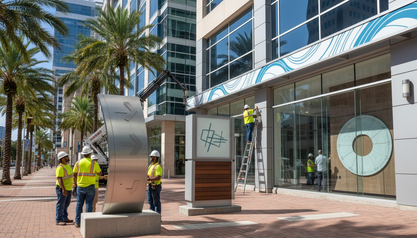
2) Positioning and sightlines
- Face the approach: position main identity signs on the facade surfaces most directly visible from the primary approach routes—sidewalks, parking aisles, and nearby intersections.
- Height vs. distance: balance letter height with expected viewing distance so copy remains legible as people approach the store.
- Unobstructed zones: keep the primary sign area free from awnings, tree canopies, or other visual clutter that interrupts sightlines.
3) Color, contrast and typography
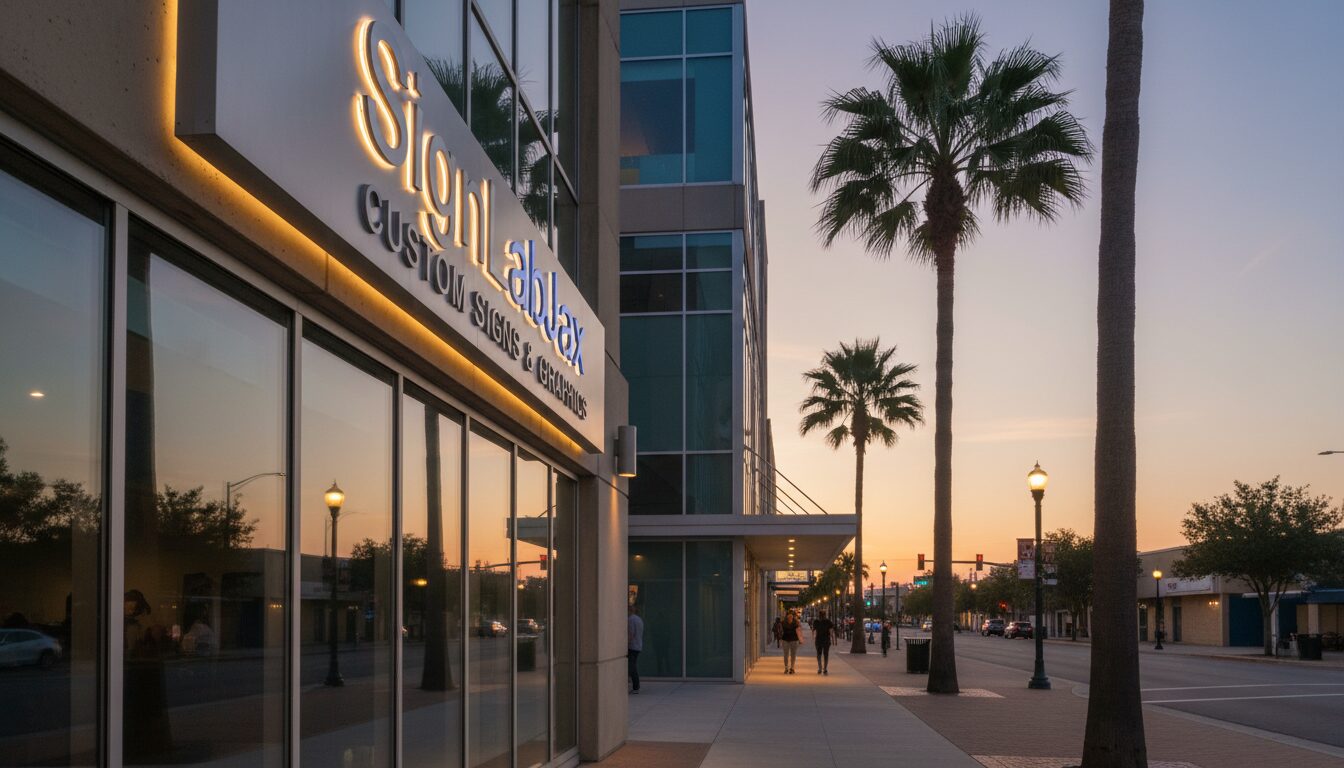
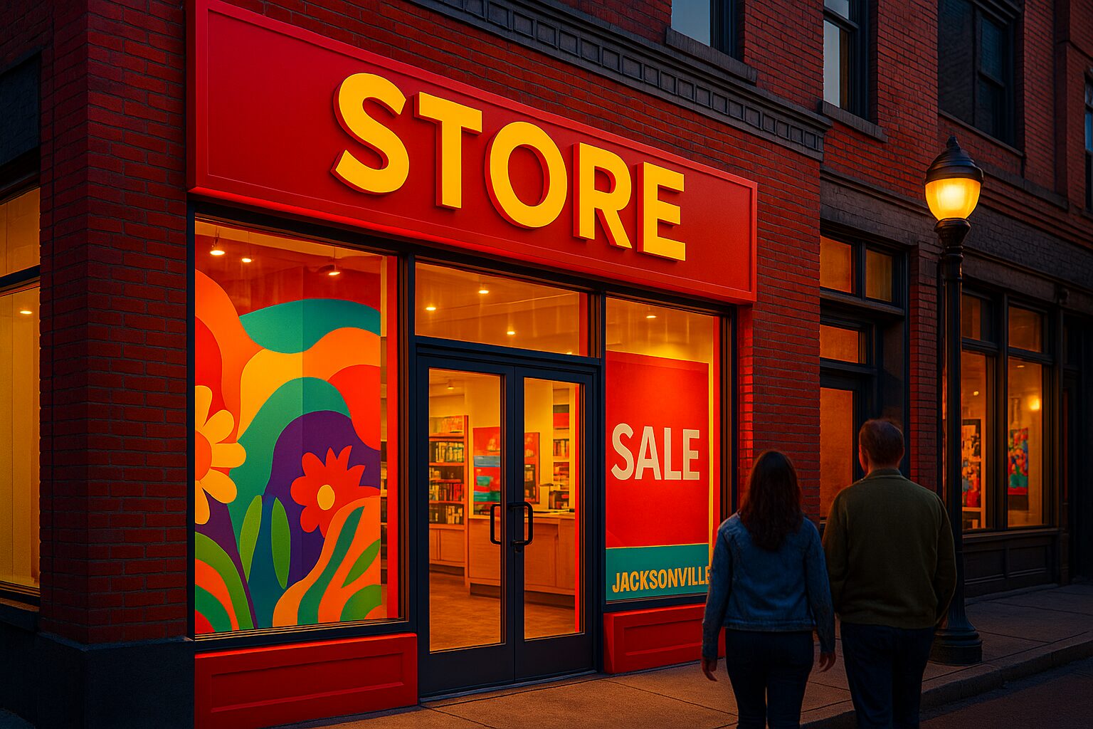
- High contrast wins: choose color combinations that deliver strong luminance contrast between letters and background for readability in daylight and dusk.
- Vibrant accents: use vibrant accent colors strategically to draw attention to the logo or entry points, while keeping the primary ID simple and legible.
- Typeface selection: prefer geometric or humanist sans-serifs with open counters and consistent stroke width for maximum legibility at distance.
4) Lighting that improves visibility
- Even illumination: avoid hotspots; evenly lit lettering reads better and photographs more consistently for social and mapping thumbnails.
- Consider ambient scenarios: check how the façade looks at peak daylight, dusk and under street lighting; choose fixtures and color temperature that preserve contrast.
- Energy & maintenance: select lighting systems that are serviceable and energy-efficient; ease of maintenance keeps the façade consistently performing.
5) Materials and durability
Choose finishes that maintain color saturation and reduce glare: UV-stable paints and coated metals, non-glare acrylics for letters, and robust mounting hardware rated for local wind loads and exposure. Durable materials maintain consistent visibility over time.
6) Quick implementation checklist
- Map primary approach directions and pedestrian sightlines.
- Define primary ID zone on the façade and clear obstructions.
- Select high-contrast color palette and legible typeface.
- Specify even, serviceable lighting and verify power routing.
- Choose durable materials and document mounting details for permits and installation.
- [Reality Filter: verify locally] Check local zoning and sign permit requirements before fabrication.
Conclusion
Strong façade visibility starts with placement: align the primary sign with approach sightlines, amplify it with contrast and strategic color, and ensure consistent lighting and durable materials. These measures increase the chance customers will see, understand, and enter your business.
For a visibility-first façade plan and permit-ready design, request a consult with Sign Lab JAX.