Great storefronts do two things at once: guide customers effortlessly and express the brand at a glance. In Jacksonville, FL, indoor and outdoor signage shape the perceived layout of a store — how people find the entrance, what they notice first, and how they move inside. This quick guide shares practical design moves and the compliance basics local businesses should know.
1) How signage improves your “layout perception”
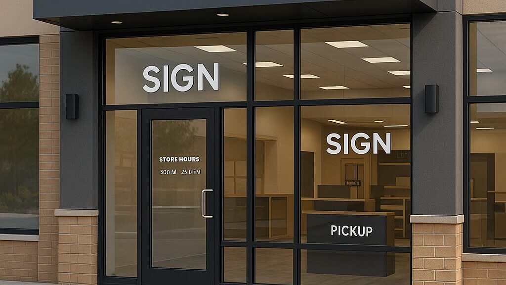
- Clarity from the curb: A primary building sign plus a clean door decal reduces hesitation and speeds entry.
- Sightline planning: Place signs where customers naturally look — approach paths, parking‑to‑door lines, and eye‑level windows.
- Hierarchy: One primary message per surface (store name), with secondary messages (hours, services) close to the handle line.
- Consistency: Typeface, color, and contrast that repeat indoors (category headers, aisle markers) make navigation feel natural.
2) Indoor vs. outdoor: what each must accomplish
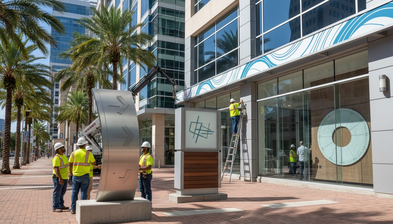
- Outdoor (fascia, monument, projecting): Be legible at distance and speed; ensure sufficient contrast; avoid clutter.
- Indoor (directional, zone headers, promotional): Short labels, consistent placement (top rails, endcaps) and lighting that avoids glare.
3) Compliance in Jacksonville: what to know before you design
Jacksonville regulates signage through its Zoning Code (Ordinance Code, Chapter 656, Part 13 – Sign Regulations). Businesses are expected to follow standards on size, placement and illumination, and most exterior signs require a sign permit from the City. For subareas (e.g., Downtown or certain overlays), additional rules may apply. Always verify your site’s zoning and any overlay provisions before fabrication or installation.
Key takeaways:
- Exterior signs typically require a permit; start with the City’s guidance and online submittal portal.
- Size allowances may relate to frontage and district rules; some districts have specific caps.
- Overlays (e.g., Renew Arlington, Downtown) can add or supersede general provisions.
4) Design practices that lift both aesthetics and compliance
- Readable first: Use high‑contrast palettes and adequate letter height for your viewing distance.
- One decision per zone: Primary ID on the fascia; hours/door info at handle height; promotions on windows away from the primary ID.
- Light responsibly: Even illumination without hotspots; avoid spill that could violate local standards.
- Durable materials: UV‑stable films and coatings for Florida sun; wind‑rated mounting consistent with permit drawings.
- Mirror inside: Use the same typography and color logic for aisle headers, counters, and pickup points.
5) Fast compliance checklist (print this)
- Identify your zoning district and any overlay.
- Confirm if the sign type (wall, monument, projecting, window, illuminated) needs a permit.
- Align proposed area/height with the district limits.
- Prepare accurate drawings (dimensions, location, mounting, lighting).
- Coordinate electrical (if illuminated) and any additional reviews required.
- Submit through the City’s portal and wait for approval before fabrication/installation.
Conclusion
Stronger storefront layouts come from clear visual hierarchy outside and intuitive wayfinding inside — executed within Jacksonville’s sign rules. That blend of aesthetics and compliance protects your brand, speeds customer decisions, and avoids costly rework.
Call to Action
Want a layout‑first signage plan that meets Jacksonville requirements? Request a consult with SignLabJAX and get a practical roadmap from concept to permit to install.