Are you planning new signage for your business or considering a rebrand that truly reflects your company’s personality? Your signage is often the first impression potential customers have of your business – and you only get one chance to make it count.
Many business owners struggle with translating their brand vision into effective signage. Should you go bold with bright colors or stick to classic elegance? What font communicates professionalism versus approachability? How do materials like metal, acrylic, or wood affect customer perception?
This comprehensive guide will walk you through the essential design principles that make signage work, helping you create a sign that not only looks stunning but actively draws customers to your business.
Chapter 1: The Psychology of Colors in Signage
Color isn’t just aesthetic – it’s a powerful psychological tool that influences customer behavior before they even read your business name.
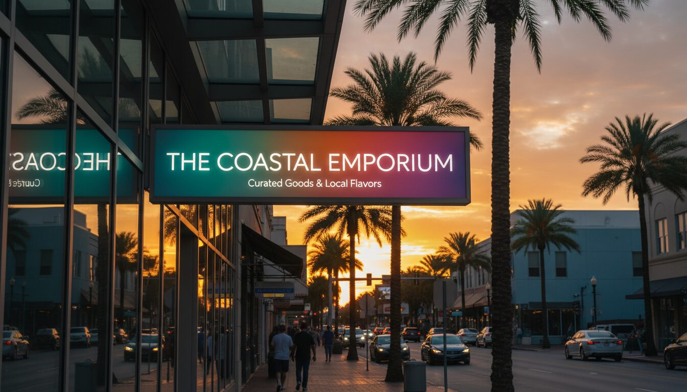
Warm Colors (Red, Orange, Yellow) create urgency and excitement. Red increases appetite and creates a sense of immediacy, making it perfect for restaurants and retail environments. Orange conveys friendliness and enthusiasm, while yellow grabs attention and suggests optimism. These colors work exceptionally well for food service, retail, and entertainment businesses.
Cool Colors (Blue, Green, Purple) communicate trust, stability, and professionalism. Blue is the most trusted color in business – ideal for medical practices, legal offices, and financial services. Green suggests growth and health, making it perfect for wellness centers or eco-friendly businesses. Purple conveys luxury and creativity.
Neutral Colors (Black, White, Gray, Brown) provide sophistication and timelessness. They work as excellent backgrounds that make other colors pop, or as primary colors for businesses wanting to communicate premium quality and elegance.
The key is matching your color psychology to your target customer’s emotional needs and your industry expectations.
Chapter 2: Typography That Speaks: Choosing the Right Font
Your font choice speaks volumes about your business personality before customers read a single word.
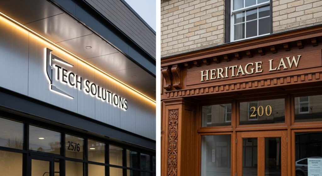
Sans-serif fonts (like Arial, Helvetica) communicate modernity, cleanliness, and approachability. They’re highly legible from a distance, making them perfect for most retail businesses, tech companies, and modern service providers. These fonts work especially well for businesses targeting younger demographics.
Serif fonts (like Times New Roman, Garamond) convey tradition, reliability, and expertise. They’re excellent for law firms, financial institutions, medical practices, and established businesses that want to communicate decades of experience and trustworthiness.
Script and decorative fonts should be used sparingly and only when they directly support your brand personality. A boutique spa might use an elegant script, while a children’s daycare could incorporate playful lettering.
Legibility rules everything. Your customers should be able to read your sign clearly from 50+ feet away. Avoid overly thin fonts, excessive decorative elements, or anything that requires customers to squint or slow down to decipher.
Chapter 3: Contrast is King: Ensuring Maximum Legibility
The most beautiful sign in the world is worthless if customers can’t read it quickly and easily.
High contrast combinations like white text on black backgrounds, or dark blue on white, ensure maximum readability in all lighting conditions. This is especially crucial in areas with varying lighting throughout the day.
Avoid problematic combinations such as red text on green backgrounds, blue on purple, or any color combination that creates visual vibration or strain. Yellow text on white backgrounds disappears in daylight, while dark colors on dark backgrounds become invisible at night.
Test your contrast by viewing your design options at different times of day and from various distances. Consider how your sign will look when backlit, in shadow, or during different weather conditions.
Size matters for contrast. Smaller text requires higher contrast ratios to remain legible. If you’re incorporating detailed information or smaller text elements, ensure the contrast is even more pronounced than your main business name.
Chapter 4: Materials That Communicate Your Brand (Modern vs. Classic)
Your material choice sends an immediate message about your business values, quality standards, and target market.
Modern Materials like brushed aluminum, acrylic, and LED components communicate innovation, efficiency, and forward-thinking. These work exceptionally well for tech companies, modern medical practices, contemporary retail, and businesses targeting younger demographics. These materials also typically offer superior weather resistance and longevity.
Classic Materials such as carved wood, wrought iron, and dimensional lettering convey heritage, craftsmanship, and timeless quality. These materials resonate with businesses emphasizing tradition, personal service, and established expertise – think law firms, family restaurants, or boutique services.
Mixed Material Approaches can effectively communicate both innovation and reliability. A medical practice might combine sleek metal lettering with warm wood accents, suggesting cutting-edge care delivered with personal attention.
Durability considerations are crucial for any climate. Choose materials that maintain their appearance through various weather conditions. Quality materials protect your investment and ensure your brand image stays sharp year-round.
Chapter 5: Bonus Tip: The Power of Negative Space
Negative space – the empty areas around your text and design elements – might be the most overlooked aspect of effective signage design.
Breathing room around your business name and key information prevents your sign from looking cluttered or overwhelming. This is especially important for businesses with longer names or multiple services to advertise.
Visual hierarchy uses negative space to guide the eye to the most important information first. Your business name should have the most prominent positioning and surrounding space, followed by your key service or product, then contact information.
Distance considerations matter significantly depending on your location type. Signs viewed primarily by drivers need more negative space and larger text than those read by pedestrians in shopping centers.
Clean design principles using strategic negative space create a more professional, premium appearance that builds trust with potential customers before they even enter your business.
Conclusion
Effective sign design combines color psychology, strategic typography, high contrast, appropriate materials, and thoughtful use of space to create signage that actively attracts your ideal customers.
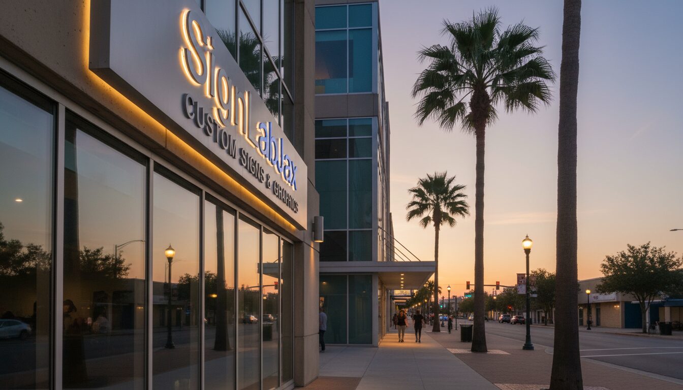
SignLabJAX has helped hundreds of businesses throughout Northeast Florida translate their brand vision into stunning, effective signage. Our design team understands how local demographics, lighting conditions, and architectural styles affect sign performance, ensuring your investment delivers maximum impact for years to come.
Ready to create signage that perfectly represents your brand and draws customers to your business? Contact SignLabJAX today for a consultation with our design specialists.